Matplotlib’s pcolormesh Function
The pcolormesh function in Matplotlib is a powerful tool for representing data from a two-dimensional array as a grid of colors. It is particularly useful for quickly and efficiently visualizing large datasets.
What It Does
- Color Mapping:
pcolormeshassigns a color to each cell (or mesh) based on its data value, allowing you to visualize complex patterns or continuous data distributions.
- Grid Representation:
- Each data point is displayed as a rectangular cell in a grid.
- The color of the cell corresponds to the value of that data point, making it easy to interpret the data visually.
Scientists, engineers, and data analysts widely use this function to visualize dense datasets with clarity and precision.
How to Use pcolormesh
- Input Requirements:
- Provide a grid of X and Y coordinates to define the horizontal and vertical boundaries of the cells.
- Use an array of Z data to represent the values within the cells.
- Visualizing Variations:
- Combine
pcolormeshwith a color map (cmap) to intuitively display variations and patterns in your data.
- Combine
Key Advantages
- Performance:
- Highly efficient for large datasets with fast rendering speeds.
- Flexibility:
- Works with a wide range of color maps, allowing you to visualize even subtle differences in your data.
pcolormesh is ideal for scenarios requiring clear and efficient visualization of complex, dense data.
pcolormesh Code
import matplotlib.pyplot as plt
import numpy as np

x = np.linspace(-5, 5, 100)
y = np.linspace(-5, 5, 100)
X, Y = np.meshgrid(x, y)
Z = (X**2 + Y - 10)**2 + (X + Y**2 - 10)**2

plt.pcolormesh(X, Y, Z, shading='auto', cmap='coolwarm')

plt.colorbar()
plt.title('pcolormesh')
plt.xlabel('X Axis')
plt.ylabel('Y Axis')

plt.show()
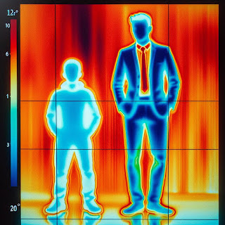
I used to analyze infrared detectors and often struggled with how to represent the images effectively. When I first saw this type of chart, I was curious about how it was implemented.
I remember watching the screen render faster than I expected and wondering what algorithm made it possible.
This chart is undeniably visually powerful, but it doesn’t work well for numerical data analysis. Its strong visual appeal often eliminates the need for numerical analysis, which might explain why many people use it.
Personally, I haven’t analyzed or relied on this chart much. Most of my experience with it has been limited to testing scenarios, with rare use in practical fieldwork.
I’ve seen wireless signals represented in a similar way before, and these charts often highlight a few strong signal spots as well as a few weak ones. Consequently, it becomes hard to grasp the overall picture.
It sometimes feels like these charts are just a way to make the data look visually appealing without providing meaningful insights.

.jpeg)